Deville Enterprises
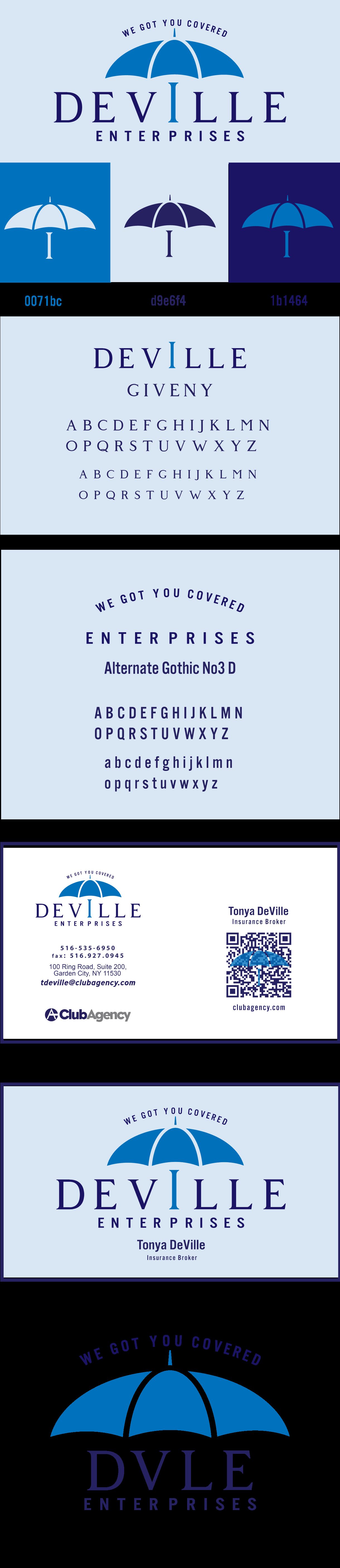
A complete umbrella-built brand identity for a Long Island insurance firm: logo, tagline, business card, and a run of community flyers.
The brief
Deville Enterprises is an insurance and professional-services business on Long Island. The owner wanted a more polished, professional presence for her growing book of clients, and gave full creative control, with one rule: the brand had to live in the blue family.
Concept & direction
Because the business is built around protection, the tagline came first: “We Got You Covered.” From there, the umbrella became the central symbol, an immediate visual cue for safety, coverage, and peace of mind.
Five logo directions were presented, exploring variations of the umbrella, wordmark, and hierarchy. The client fell for one immediately: the umbrella paired with a refined serif wordmark and clean sans-serif support.
The system
- Logo: primary umbrella mark with the full “Deville Enterprises” wordmark, plus a compact DVLE lockup for tight spaces
- Color: bright blue, soft light blue, and deep navy, built to stay flexible across print and screen
- Type: Giventy serif for the wordmark, Alternate Gothic No. 3 D for the tagline and supporting text
- Print: a clean, professional business card with a QR code to her online presence
Out in the community
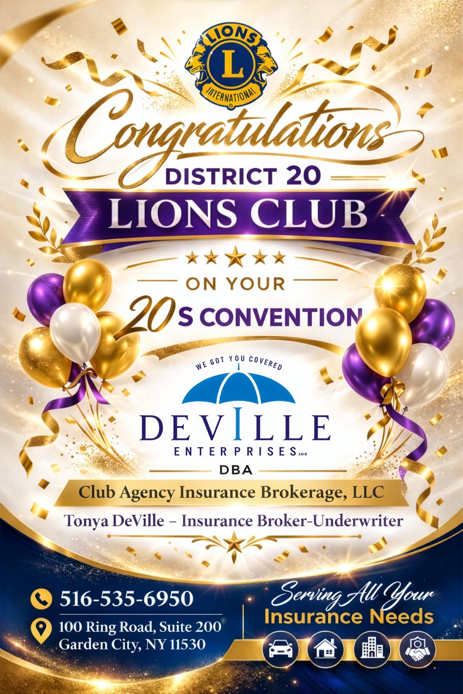
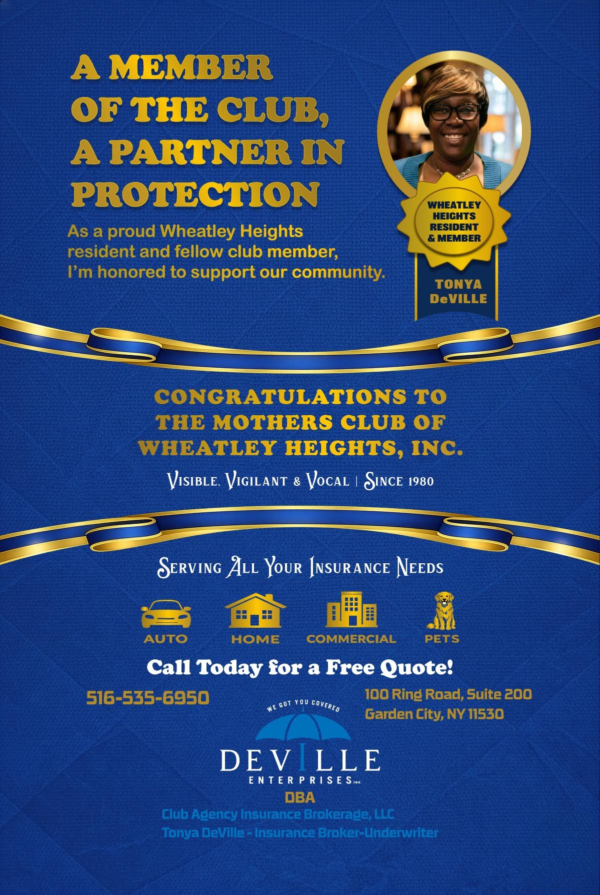
The identity was extended into a series of congratulatory and event flyers, each keeping the umbrella mark and tagline consistent while the headlines, colors, and decorative touches flex for the occasion.
The result
A cohesive, recognizable identity that communicates coverage, trust, and professionalism everywhere it shows up, from the business card in a client's hand to a full-page flyer at a community event.